Accessibility In Design Is No Longer A Nice-To-Have: It’s A Necessity
UI/UX Design

The clock is ticking for public sector organisations to comply with the government’s accessibility guidelines. In fact, they only have until 23rd September 2020 to bring their websites to government standard. Let’s dive into what that means for both the public and private sector and why accessibility is non-negotiable in 2020.
Accessibility and digital inclusion have been hot topics in the design community for over a decade, yet still many see these disciplines as supplementary to a project, rather than integral. When it comes to UX design, accessibility is absolutely paramount for every single project, not just those designed to be used primarily by people with disabilities.
Designing for accessibility is not hard - so why are so many organisations still ignoring the needs of over 20% of the country’s population? It isn’t just a usability issue, it’s a social, political and even legal one and it’s time to take a stand against lazy design that further perpetuates the widespread marginalisation of people living with disabilities.
What is accessibility in design and why is it important?
Accessibility in design is when the design team takes steps to ensure the end product, be it a website, app or even offline content, is accessible, usable and inclusive to all users. This includes taking a number of steps to ensure content can be easily used by people with disabilities, including those with visual impairments, hearing impairments, learning difficulties or physical/motor disabilities.
The UK government has led with the way by laying the foundations for accessibility for design with a series of poster guides from its dedicated content design team. In fact, our government is one of the world leaders in digital accessibility with several laws that enforce anti-discrimination and set the standards for goods and services across the country.
So, despite gov.uk’s sternly worded introduction to accessible services that states: “Your service must be accessible to everyone who needs it. You may be breaking the law if you do not make it accessible,”many public sector sites are yet to meet the standards.
The clock is ticking for these offenders as the government has given public sector websites until 23rd September 2020 to comply with the standards, extending that to 23rd June 2021 for apps.
The line is less clear for commercial websites, but with businesses in the US and Australia facing lawsuits from users, it’s only a matter of time before these attitudes reach UK shores and businesses are held accountable for not putting measures in place to ensure their websites and apps are accessible to all.
How to design for accessibility
Now that we’ve established that accessibility is a vital part of UX design, it’s time to explore what that means and how to do it.
As an organisation with a website or app, it is your responsibility to make sure your service can be accessed by as many people as possible. Here are some simple design considerations that are easy to implement but make a significant impact to the lives of people with a variety of needs:
Consider colours
Colour is a very important part of accessibility. It’s easy to get carried away choosing colours to portray your brand identity, but if those colours adversely affect the usability of your website or app. For example, people with low vision or people on the autistic spectrum may struggle with bright contrasting colours.
Choose simple and clear colours to get your brand across without alienating your users. If in doubt, try an accessible colour checker to determine if your palette is accessible to different types of users.
Simple and consistent wireframes
In UX design, we often begin a project with a wireframe to portray a user’s journey through the website or app. How often do you think about different kinds of users other than yourself when creating these wireframes?
Discovery workshops focus groups and open discussions with different types of users can help to shed light on how the best display information online - remember to KISS (Keep it Simple, Stupid).
Under the bonnet
Accessibility in design is not just about what you see, but also what makes your website or app work. Thanks to the rise of screen readers, people with visual impairments are now able to explore the online world easier than ever before.
There are a few considerations you must make to make sure your website or app is accessible to these users, such as the inclusion of alt text on images, clear and concise page titles and descriptive links (ditch the ‘click here’).
Content design
This is where your content team will need to work closely with your UX and UI designers to ensure that written content is accessible, too.
Many businesses make the mistake of bringing in a copywriter or content strategist later in the project and they end up having to squeeze a large amount of written information into an infrastructure that is clearly built with only aesthetics in mind.
However, by including your content team from the earliest stage of any project, you will be able to clearly define messaging, space and accessibility concerns before the first lines of code are even written.
Some of the biggest content design considerations include avoiding large, dense blocks of text in favour of bullet points, clear button text that links to the desired action and a linear content framework throughout - particularly important for those public sector sites that typically house a lot of information that people need to live their daily lives.
Don’t assume
Following the rise of smartphone and tablet technology and the seeming omnipresence of super-fast broadband, designers have fallen into the habit of making assumptions about users.
Assumptions are the antithesis of designing for accessibility, as we risk making decisions that only satisfy our own desires to be the slickest and most ‘cutting-edge’ brand in our space.
When you put all of your attention into trying to be the Apple of your niche, you miss key considerations that may not be the most visually appealing but are vital to designing for accessibility.
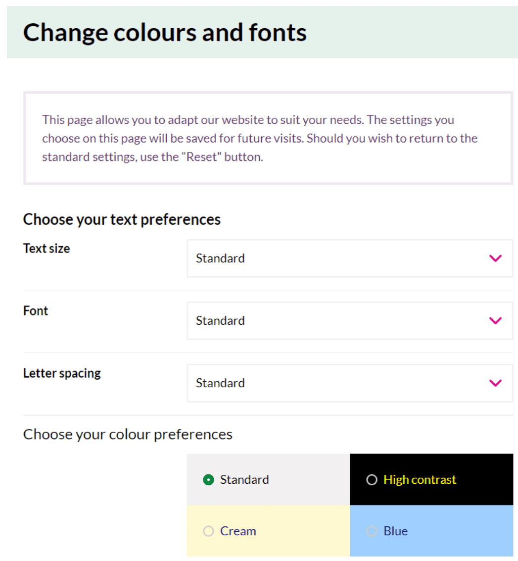
We’ve already talked about colours but you should look to take this to the next level and give users the power to pick how they want the information to be displayed depending on what they find the easiest to access.

You can also avoid assumptions by implementing a “did you mean” functionality into your search bar, so users who struggle to type or spell (such as people with dyslexia or impaired motor skills) can still find what they are looking for.

Got an idea? Let us know.
Discover how Komodo Digital can turn your concept into reality. Contact us today to explore the possibilities and unleash the potential of your idea.

Sign up to our newsletter
Be the first to hear about our events, industry insights and what’s going on at Komodo. We promise we’ll respect your inbox and only send you stuff we’d actually read ourselves.


