Grid System in App Design: A UI Essential
UI/UX Design
App Development
What is a grid system?
Grid systems are a concept of organisation used in various creative fields, a way to impose visual logic meant to allow the viewer to interpret and understand what they’re looking at. In design specifically, grid systems are governed by alignment, spacing and proportion. They bring myriad benefits such as:
Creates clarity: grid systems are designed to guide the eye and make it easy for readers/viewers to scan the objects and text on a page or screen.
Establishes visual hierarchy: your brain works by scanning information quickly and making judgements. The grid-based design creates a set of rules your brain can immediately understand and follow from page to page or screen to screen.
Defines experiences: grid systems create a coherent experience for a user, whether they’re enjoying a website through their phones and desktops or reading page after page in a newspaper. The grid is what keeps each page/screen recognisable even when the information contained within is different.
Speeds up workflows: in an app development project, efficiency is key to reducing costs. Grid systems are a framework for the design team to work from, the development team to code around and the overall project to hang from. Only by establishing a grid can a designer ensure that the finished product will look as intended.
Though grid systems are an established tradition in the history of art, modern designers have had to change their approach as new technologies have challenged grid-based ideas.
Now, UI experts creating app designs must utilize grid systems in a new, responsible manner that can involve multiple grid styles in a single project.
But to discuss the current style of grid-based design, we have to first look back.
The history of grid systems

The concept of a grid system in design is linked to history. Organising elements into set areas of a page based on an underlying system has been practised as far back as Renaissance period painting.
But, it was truly defined in the 13th century by Villard De Honnecourt, who invented a system for page layouts with fixed ratio margins which are still in use today. Even photography features a grid concept, with the ‘rule of thirds’ suggesting images are more dynamic when the focus is off-centre.
The grid system idea was further developed with the rise of newspapers and other print media, where multiple ‘pieces’ were present on a page as opposed to the single-text elements present in a traditional book.
This meant that designers had to consider more than just the margins and text alignment - they needed to create modular grids that could include text and images whilst remaining legible and engaging.
The biggest change in grid-based design was the advent of the De Stijl, Modernist, Bauhaus and Swiss movements. These artistic and architectural movements were different but shared a similar focus on stripping away the ornamentation of the Art Deco era and focusing on function.
Digital transformation
Computer-based design welcomed a new era of freedom where designers could experiment without the confines of physically designing the page.
This meant new aesthetic options such as the freedom to choose typefaces, colours and textures. To ensure that internet users could read and interpret pages, grid systems were reintroduced but we're far more flexible.
As grid system design has continued to evolve, the most modern web designs prioritise fewer columns and bolder use of imagery.
In a world of sleek minimalism, grid systems keep things legible and easy to interpret.
App development has skyrocketed in the past decade, and grid system design has grown with it. In a world where touchscreen interaction has become commonplace, grid designs enable UI designers to create a visual uniformity that guides users through an experience.
While apps might have multiple screens that use different grid layouts, the overall impact of a clean grid-based system is that a user can more easily intuit information and points of interaction (usually buttons).
Modern app design UI considerations: make grids great again

However, the issue with app design is that unlike the historic printed page, which has defined sizes and margins, it is harder to impose grid-based order on a responsive, dynamic app that can work on multiple devices and in different ways.
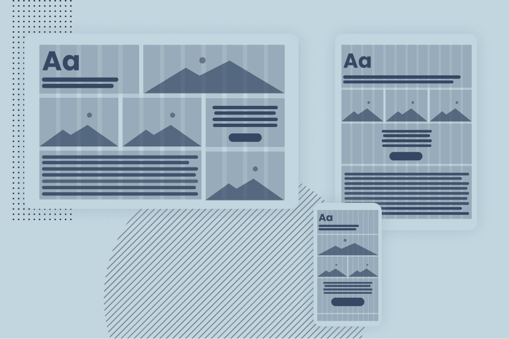
In addition, responsive grid systems can adapt to different screen sizes, which is a must in a world of multi-device browsing and the popularity of both iOS and Android.
But considering the content and format within an app can be extremely variable, how can designers possibly create grid-based rules and templates to work from?
Rethink your workflow
Firstly, you need to stop thinking like a traditional designer - which extends to the tools you’ve probably been using for years.
Photoshop, for example, was developed with the printed page in mind, and though it has adapted, it is not the ideal environment to design user interfaces for apps.
Designing beautiful and engaging UIs in apps requires you to 1: stop relying on traditional tools and 2: stop trying to create a one-size-fits-all solution.
Rather than creating a single grid system for apps, experiment with creating an artboard, toolkit, or grid-based designs that will inform the app’s overall design. This artboard will include grids that consider different aspect ratios (such as the landscape and portrait displays for phones and tablets) as well as the output (such as apps that work across Android and iOS and even desktop).
But if you’re going to the effort of creating multiple grid systems, aren’t you essentially removing the need for ‘order’ imposed by a single grid style?
No - not at all. By designing in a more responsive mindset, you’re still creating a visual hierarchy and aligned approach - but one that is device-agnostic rather than built for a single format.
Design grids for experiences
While UI and UX design are not the same, there’s plenty of cross-share worth mentioning, especially in light of grid-based design systems. UX designers often practice ‘design empathy’, which involves understanding user needs and designing around those.
Following the same mentality, a designer can create grids based on user requirements.
For example, if you’re designing an app used by medical trial participants, you’ll need to account for their impairments and mixed mood. If you were instead designing an eCommerce app for a younger demographic, your grid design would change to reflect their habits.
Know the standards
Grid design is flexible, but there are still some clear rules to be aware of.
Understand common screen resolutions - desktop: 1440x1024, tablet: 768x1024, mobile: 320x640. These all impact how your grid will display.
Use columns appropriately - while 12 column bootstrap designs are very common, they aren’t always the best choice. Your grid elements should reflect user needs and make the UI straightforward.
Utilise framing to draw interest - add visual weight around certain grid elements with frames.
Break the grid - for important elements you need to stand out, try creating a breakout from the grid. This could be, for example, a full-width CTA box atop a classic 3 column grid.
Test and tweak - test your designs whenever possible. At first, that’ll usually be your internal team or QA testers, but you can test with real users once an MVP is launched. This is made even easier in app development thanks to the ability to iterate…
Iterate at every chance

Unlike print media, which is ‘fixed’ in that once it’s published, it’s ‘done’, app design is ongoing. UI designers get to enjoy the luxury of being able to amend their designs based on live feedback and user data.
In this light, your grid system should never become a burden. If certain columns are being ignored, remove them. If users are only clicking a certain button, prioritise its space in the grid.
It’s this level of adaptability that makes grid systems robust enough to survive generations of design. By establishing a grid, you’re not limiting your creativity but instead structuring the user’s experience.
As a result, you’re creating a system that makes life easier and interaction more intuitive. With app design, where every interaction can be the difference between users engaging or uninstalling, the advantages are too vital to ignore.
If you’d like to work with a UI design team with vast experience in app design and development, get in touch with the team at KOMODO today.

Got an idea? Let us know.
Discover how Komodo Digital can turn your concept into reality. Contact us today to explore the possibilities and unleash the potential of your idea.

Sign up to our newsletter
Be the first to hear about our events, industry insights and what’s going on at Komodo. We promise we’ll respect your inbox and only send you stuff we’d actually read ourselves.


