How Social Media Apps’ UX & UI Are Designed To Engage… And Be Addictive
UI/UX Design
By Thomas Wood - Head of Product Design at KOMODO
Designers have a big responsibility. Often overlooked, design is everywhere.
Think of the last chair you sat on. Before you took your seat did you think ‘this is going to collapse from underneath me when I sit in it?’ No, because chairs are engineered to be sturdy, to support our weight, to make us comfortable.
Where are you going with this? The article is about social media apps… Well, we often don’t think about what is going on behind a design because it works. And in the case of social media apps, perhaps a little too well.
The attention economy
The attention economy is a fairly new concept. In essence, it describes the supply and demand of someone’s attention. Keeping people’s attention is the business model on which most social media apps are built… To paraphrase the popular adage: If the product is free, you’re the product. Attention = eyes on adverts. You know the drill.
So going back to design, social media apps have to create experiences to keep our attention firmly fixated on their product. And designers play a huge role in achieving that goal.
UX Vs. UI - What you don’t see is just as important as what you do
To understand the complexity of social media design, you need to look behind the curtain. Yes, a lot of what makes social media so engaging is how they look, and the way the interfaces drive us to action and fill the space on our screens.
However, a lot of the features that make social media so engaging is the deep understanding of human behaviour. The user experience design (UX design) is so well executed, from the way we interact with other users, to how we create content and share it.
So, what’s the aim here?
We know that a LOT of careful thought goes into designing a product. So, we want to deconstruct the design of social media apps to show you how they use design to grab your attention, maintain it and keep you exactly where they want you.
Think back to the earlier chair analogy. People often place trust in design - but what happens when that trust is exploited? Let’s take a look at how some of the top social media apps exploit psychology, and hijack our brain chemistry and design systems to keep us hooked.
In this article, we’re going to cover four of the big players:
TikTok
YouTube
Instagram
Reddit
Let’s jump in!
TikTok
Let’s start with the ‘new kid on the block’. However, the extent to which we call TikTok the new kid is relative only to the age of other social media platforms. Piggy-backing off lockdown boredom and people’s need for connection during the Covid-19 pandemic, TikTok shot to 1 billion users faster than any social platform has done before.
TikTok is designed with recommendations at its core. Short and snappy videos seamlessly feed into the next via an endless scrolling user experience. The bottomless scroll certainly works, with data suggesting that a UK user can spend up to 60 minutes per day on the app.
Using similar design patterns to YouTube (we’ll cover this later), TikTok has had its fair share of criticism. Addictive behaviour is promoted by the endless scrollability of videos. TikTok displays a video in full-screen, played at a maximum of 3 minutes - recently increased from the 15/30/60 seconds format. All while the algorithm serves video after video— easily navigated with the swipe of a finger.
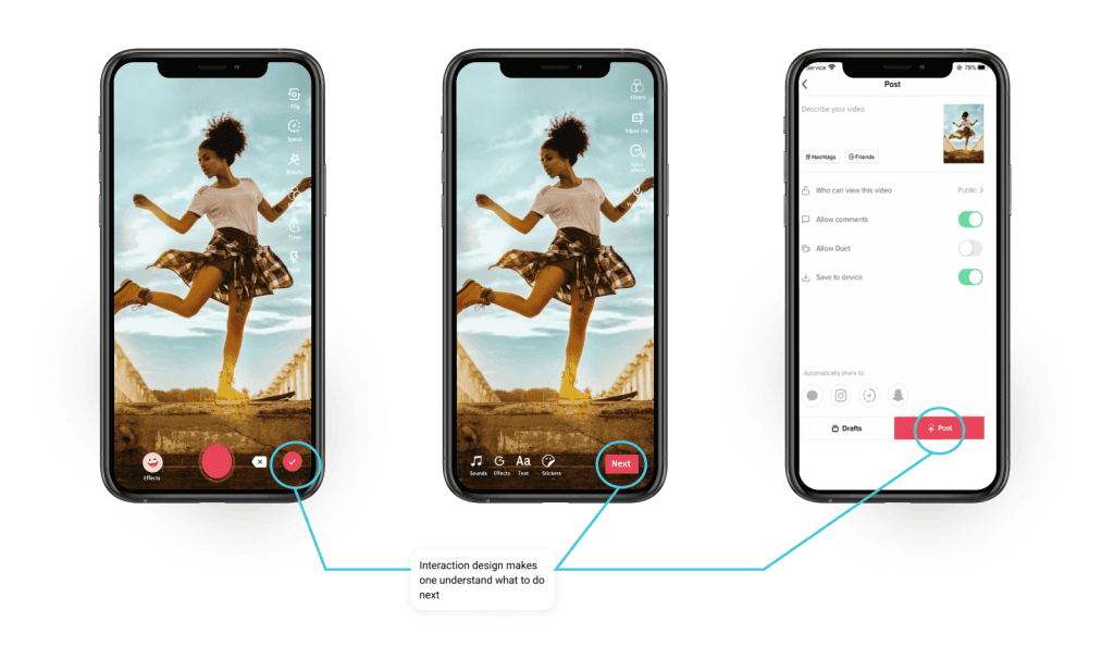
Not only does TikTok make it so easy to consume video content, but it also uses a very strong and engaging visual UI pattern to allow creators to produce content faster. Guiding you through each step with the use of colour and conveniently placed primary calls-to-action.
TikTok are community champions
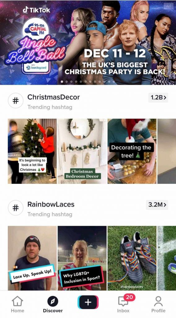
The algorithm and hashtag system is designed to take advantage of the simple content creation features. Trends or popular activities demand participation, each one gaining popularity as users put their spin on them as the trend grows.
Unlike Twitter, which surrounds its hashtags around discussion, news and current events, TikTok has designed hashtags to actively perpetuate content and trends in a much more colossal way. Hashtags and trends snowball, accumulating thousand of videos behind a particular sound for example - with some trends easily side-stepping common barriers like language.
In fact, TikTok completely removes typical barriers to entry. With Facebook, Twitter or Instagram you start by following nobody. Without connecting with others, you cannot fully experience the platform. TikTok is geared to hook you from video one, becoming consistently more adapted to YOU. Once a user's behaviour is learned, its ‘For you’ page begins to populate with videos that reflect the content you like to consume.
All eyes on TikTok
TikTok’s highly engaging and addictive design isn’t accidental. It is backed by powerful artificial intelligence along with a seamless UI that bleeds screens into one other. The content plays through without the user having to do anything but swipe. Powered by its algorithm, TikTok serves short bursts of content that you’re likely to enjoy and due to the frictionless navigation, it creates an endlessly engaging experience.
TikTok’s Icon design carefully shaves redundant information from an app. Using universally recognised iconography, their placement on the right of the screen works extremely well in engaging users.
90% of the world’s population are right-handed, so a majority will be holding phones with their right thumb hovering at the bottom right area of the screen. This is why TikTok chooses to place the majority of its interactive UI opting for this area as opposed to the traditional bottom navigation bar. Overall these features increase engagement within the app and allow for one-handed use - perfect in an age where we’re interacting with multiple screens at once.
The influential design feature in TikTok is its screen layout. By making video the main focus of the screen, TikTok removes external distractions and keeps users engaged for longer.
While watching videos, the interactive elements, caption, description will transition into the background with a fading motion—unlike Instagram’s feed for example that, allows a user to engage with multiple captions on one screen while scrolling.
TikTok is the king of short-form content
TikTok isn’t the first short-form video app. Remember Vine? However, TikTok has really capitalised on ‘the content generation’, shorter attention spans and the huge advancements in AI technology.
TikTok’s recipe for success is now starting to be implemented into technology outside of the social media realm because the idea behind the design is so engaging. Other media platforms like Netflix have released their ‘Quick Laughs’ feature on their mobile app. Even more recently, the music streaming tech behemoth Spotify has announced testing for the Discover feature.
The mirroring of TikTok shows just how powerful their design patterns are!
YouTube
TikTok may be leading the way on short-form content, but when it comes to sheer scale, YouTube takes the crown. In February 2020, it is estimated that around 500 hours worth of content is uploaded every minute. YES, YOU READ THAT RIGHT. Founded in 2005, YouTube has had our attention for much longer than TikTok. Actually, YouTube invented the playbook for keeping us hooked on video content.
YouTube’s design captures users’ attention through visual content that is relevant to them. Through rigorous A/B testing, YouTube is optimised to the highest degree. It provides the simplest possible UX design, opening the fastest routes to the next piece of content.
It does this by keeping the user on a conveyor belt of videos, so to speak. With a combination of its autoplay feature, recommendations or prompts from the creators themselves, you are guided through to another video as quickly as possible. The endless cycle is now colloquially known as the YouTube 'rabbit hole'.
It’s all about personalisation
A major advantage YouTube has is how it works with everyone’s favourite search engine, Google. Through complicated machine learning, compiling native data such as likes, dislikes, and video views combined with Google’s data creates a huge pool of behavioural information which YouTube can pull from.
It’s sometimes easy to forget design isn’t just what we see visually. UX design sits underneath the UI, the design we see. YouTube are UX master and they receive this accolade through intelligent personalisation.
With all the data on the content you enjoy watching, your Youtube homepage will be tailored to you. It offers an infinitely scrolling page with videos that match those which are similar to the ones you enjoy. Combined with trending videos and your subscription, it increases engagement exponentially.
Meanwhile, users are receiving a dopamine hit through learning, education, humour, curiosity and all the other emotional appeals that stimulate our internal reward system, the neurotransmitter Dopamine.
YouTube wins. Because when you come back again, say in 24 hours, there will have been another 720,000 hours worth of content uploaded ready for a newly personalised experience.
Everyone’s favourite photo-sharing app, Instagram keeps us coming back like no other social media app does. A hive for social activities, from its humble 1080x1080 square beginnings, the app has gone on to dominate with features such as stories and reels that give us a range of ways to share our lives with our families, friends and fans. With over a quarter of the world's internet users visiting the app each month, it’s got to be doing something right to keep our attention.
To start, Instagram is built on one of the most cunning and addictive features ever created. The like button. What started as an innocent idea, has turned into a much more nefarious problem. Even one of the original designers of the Facebook like button, Justin Rosenstein, has said “It is common for humans to develop things with the best of intentions and for them to have unintended, negative consequences.”
The like button is the main design feature that draws users back. When we receive that like, we get a rush. A feeling of validation. Social acceptance. It’s a modern currency traded all over the internet - and it has an extremely high value - To us and advertisers. Every time we receive a like we get a blast of dopamine.
To make matters more serious, the like button has a partner in crime. The push notification. It is one of the main reasons we return to an app as often as we do. When we receive notifications with likes or interactions, we want to engage.
The more we engage, the more dependent on the app we become. The app’s design exploits our need for interaction and wanting to be involved. Got FOMO anyone? The continuous feedback loop creates a habit that’s hard to break, making the like button one of the most powerful AND dangerous design features of the digital age.
Gambling in disguise
Instagram is just one of the many social media platforms that use techniques taken straight from gambling to keep you hooked. Think of it as a slot machine. You get variable rewards from pulling the feed up then down in order to refresh. You don’t know what reward we’re going to get, but after the loading is finished, you’ll likely be served a post you’re interested in. In the time you wait, anticipation is built up from the load time and the behaviour is reinforced. If you’ve ever been at the top of your Instagram/Facebook/Twitter etc. you’ll know this design pattern, and the action almost completely mimics the main action on a slot machine.
It calls itself the front page of the internet. Its tagline: ‘Dive into anything’ really sums up what Reddit is about. Content. With 52 million daily active users, Reddit may not get the attention of some of the more popular social media apps, but it certainly knows how to keep you coming back for more.
Reddit’s main focus has always been its content. That much is clear from its upvote/downvote system. The nature of this design system is to encourage users to not only post information they may deem as popular/useful/controversial but also vote on content they value most. Thus, pushing the most valuable content to the top of the site or subreddit.
A million minds of its own
Actually, Reddit is a container for millions of little and large communities called ‘subreddits’. In these smaller forums, people can discuss anything. Chances are, you can think of anything and there’ll be a subreddit for it.
This is where Reddit really takes advantage of human psychology. Because you can find a subreddit on practically anything, enabling users to find like-minded people. This plays up to a cognitive bias called Confirmation Bias. This is where we search for ideas and opinions that confirm our own.
So, when someone upvotes or downvotes a piece of content on Reddit, they are actively building on their own belief system. However, this has a side effect on the user or creator posting the content. Because the design system promotes popular content, users fall into the trap of wanting to feel liked and important. Producing content that is upvoted can give that all-important dopamine hit to a user.
One of Reddit’s most popular subreddit is r/collapse which is a subreddit focused on the ‘Collapse of Civilazation’ described as “Discussion regarding the potential collapse of global civilization, defined as a significant decrease in human population and/or political/economic/social complexity over a considerable area, for an extended time. We seek to deepen our understanding of collapse while providing mutual support, not to document every detail of our demise.”
The popularity of the upvote system can be seen here alongside the infinite scrolling design pattern and the rewarding of dopamine hits—coming through the rewards or upvotes someone receives when posting engaging content that has traction. Combining it all with the fact that humans are designed to react to threatening information first has created a well-designed melting point of engagement to the point of addiction.
Where do you draw the line?
Look, we’re not suggesting that designers should create dull, lifeless and unengaging experiences. That’s definitely not the point we’re trying to convey.
You can learn a lot from what the tech giants are doing with their products. Despite questionable practices, there’s a reason they are so successful. But as designers, we need to draw a line between unethical practices and creating exciting experiences for our users.
And to do that, the focus needs to be fixed on the user. What will improve their experience? What are the needs, wants and frustrations? Through empathising with the user, create products that solve their biggest problems and never put your needs first. By designing with the user in mind, you’ll create the kind of loyalty that can only be achieved through exceptional design.

Got an idea? Let us know.
Discover how Komodo Digital can turn your concept into reality. Contact us today to explore the possibilities and unleash the potential of your idea.

Sign up to our newsletter
Be the first to hear about our events, industry insights and what’s going on at Komodo. We promise we’ll respect your inbox and only send you stuff we’d actually read ourselves.
