Why Your Business Needs Proper UX Processes Now and How to Implement Them
UI/UX Design

User experience (UX) is fundamental to the success of every digital project. Understanding the user and designing based on their needs is crucial - but some agencies and businesses remain unable to adopt a successful user-first approach and a successful UX design process.
Even in a best-case scenario, most businesses see UX as a box-ticking exercise: performing a minimum level of user research and design and then pressing forward with their plans. But considering every £1 spent to fix a problem in design becomes £5 during development and £30 once launched, it pays to get UX right from the start.
It sounds cliché, but by looking after your users, you’re looking after yourself. A robust approach to UX design processes WILL reduce costs, increase order value, get conversions and give you loads of brownie points/karma/kudos/whatever gets you going.
A strong UX process is essential to ‘getting it right.’ But a UX process isn’t just a step-by-step workflow. It’s a core cultural shift, embedded in the way your business operates and the way each team views users.
Unfortunately, most businesses are nowhere near having an effective UX process in place.
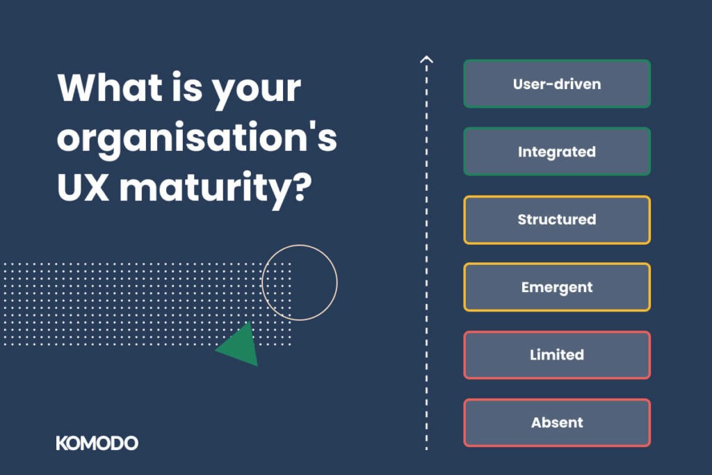
Most organisations can be defined by their UX maturity, a scale presented by the Nielsen Norman Group to gauge a business’ UX culture:
Absent: UX is ignored or non-existent - the business likely ignores a user’s needs and drives forward based on internal bias. UX is either totally ignored or is instead simply discounted as a ‘not for us’ concept. Typically, companies that are entirely absent of any UX thinking are those from traditional, non-digital fields that have yet to encounter user-focused strategy as a core idea.
Limited: Erratic approach to UX - the business likely engages with some UX principles because they know it is a ‘nice to have.’ No dedicated UX roles or processes are established in the business.
Emergent: UX work is present across more than one individual in the business, becoming part of how teams work. There are people in UX roles, but there’s no established UX process across multiple areas.
Structured: The business recognises the value of UX and has implemented it, with leadership actively promoting UX. User research is conducted, a dedicated UX function exists and most teams are familiar with UX. This, unfortunately, is as far as most businesses ever get.
Integrated: UX is now a comprehensive practice across all teams, with every individual fully aware of what UX is, how it impacts the project and how to conduct UX exercises. UX serves business goals.
User-driven: User-driven companies are the ‘unicorns’ of the world as they are rare. These businesses have UX baked into their every decision. They make decisions, designs and products based more on user needs than on business goals.

At KOMODO Digital, we typically work with businesses that are at the earlier stages of this UX maturity model. Their teams are aware of UX and would like to implement it more but struggle to do so through resources and lack of process.
As a studio, we offer the additional resources required but also get to showcase what an effective UX process looks like.
This allows your business to see a best-case scenario and understand UX from the ground up, giving you the insight needed to carry on UX principles once the project is completed.
The UX process & some workflows you can try
Let’s delve into a past KOMODO project to see how an effective UX process can help raise your understanding of user-centric methodologies.
The project was to design an EV charging app that catered to users' specific needs who were finding the realities of EV ownership a hassle.
Don’t rush research
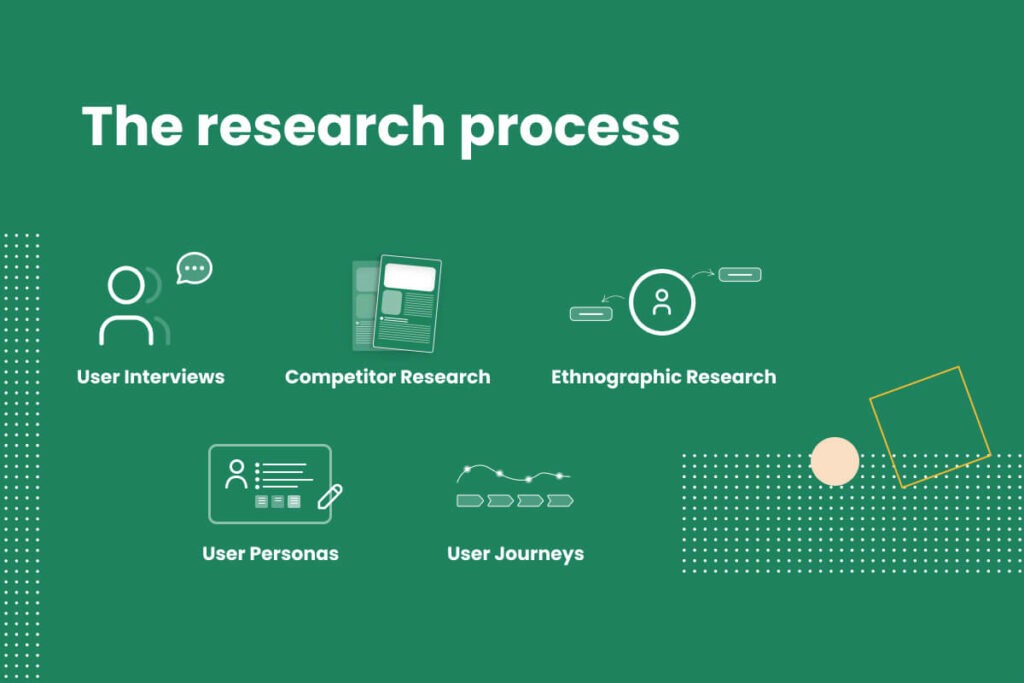
In our experience, many businesses quickly rush to prototyping and mock-ups based on what they THINK is needed. Instead, we always try to argue the research case first. In this project, we split each design sprint into stages and prioritised the Discovery and Research phase first. Research exercises can include:
User interviews
Competitor research
Ethnographic research
User personas
User journeys
N.B. This is not an exhaustive list and is just an example of a strong research and UX-driven process.
User research is not a box-ticking exercise. All effective UX processes begin with detailed research that aims to find the genuine challenges users face, as, without them, you are designing redundancies. Hosting user interviews give you a basis from which to build personas and journeys but can be expensive and hard to arrange - which is why they’re only common in businesses that have a UX-first methodology.
If you can’t arrange user interviews, try utilising any real data you have access to, such as Google Analytics, so you can build an idea of what users need without guesswork.

For our EV app, we performed our initial research and competitor analysis to draw up common pain points, identifying the issues that most hampered a user’s experience in the EV world.
This included technical elements such as intuitive UI, but also general user challenges such as not being given enough data or complicated set-up phases.
Competitor research
Competitor research is crucial to UX too - but not if you do it the ‘standard’ way. You shouldn’t solely assess what competitors do, what their apps look like and how they work. Instead, think of how they are serving user needs.
In this example, we gauged the review scores of each competitor app and what features they offered to match the user needs we defined in our research. We performed ethnographic research to ascertain some outside factors that affected the core EV app experience, such as how many users used mobile to pay and what influences the at-home charging decision.
Ethnographic research isn’t necessary, but whenever you’re launching an app that has a specific target market, it’s worth looking at the supplementary behaviours that affect how a user might approach the app.
User personas
Personas are fairly common nowadays - with even businesses less mature on the NN model above understanding some level of persona work.
They typically group users by demographic and behaviours. The biggest difference between general user personas and effective ones is that each persona must be informed by real research and not guesswork or assumptions. They need to be genuine and based on actual user requirements.
User journeys
Another crucial step and one many UX-averse businesses mishandle or ignore entirely. They are not the same as your personas - a journey is a map of how a user interacts with the product, detailing each crucial decision stage. Take a look at some examples of user journeys for the EV charging app to see how to do these right.
Empathy maps
Empathy maps take things a layer deeper than user personas, giving us more insight into behaviour. Empathy-focused UX design looks to understand more than just the needs of a product but build a wider understanding of the environment and behaviours a user operates from.
They typically map each persona by what they see, hear, say, do, think and feel. You’ll notice that so far, no real ‘design’ or development has started. Taking time to conduct this initial period of research and get it right is what differentiates a good UX process from an average one. But UX doesn’t end at the research stage...
Designing for users

A true UX process begins at the research phase but continues into creation. Some immature UX businesses do their initial research and then fail to implement said research in a meaningful way.
In the EV app example, we progressed to wireframing and prototyping - but only as a result of the measured behaviours and requirements, we had detailed in the initial research. Every aspect of the wireframes was built to offer solutions to user needs. Without establishing these first, your wireframes are only satisfying internal bias.
The UX-based considerations of wireframing include component types, how buttons are formatted and information architecture. Some users, for example, may not be familiar with ‘burger’ style menu buttons and may benefit from a more visible, engaging button design. The next stage, once wireframes are agreed upon, is to create a working prototype.
Note that this is not the same as a ‘Minimum Viable Product’ or MVP - which we’ve discussed in another article. Prototypes represent the working product but only give a barebones suggestion of how things will look and, crucially, ‘feel’. Businesses that follow a UX process will find that prototypes are more effective and less prone to change if they’re built with user research in mind.
In contrast, businesses that fail to carry out sufficient research may have to redo their prototype repeatedly. The worst case, however, is when a business that doesn’t utilise UX signs off on a prototype solely because the stakeholders or managers love it.
This can lead to a disastrous launch where the product looks and ‘feels’ right to the internal team but fails to meet any user expectations when launched. Remember the figure earlier where we said for every £1 invested in design, the same issue costs £30 once live? Yeah - this is why. After the prototypes are signed off, the design passes over to development, and the actual build begins - with sprints targeted towards releasing the MVP (if you're creating a new product) or implementing the changes into the product.
Once the MVP or new version is launched, UX becomes more focused on refinement based on real user feedback. You should actively gather feedback in the form of reviews and commentary - but also look into the data behind the app or product.
See how users are interacting and utilise those statistics as a means to drive UX forward. When we discussed the UX maturity model, the most ‘mature’ UX teams are those that will innately recognise the value of using data and make design and development decisions based on it.
The reality is that the UX process is not linear. It can differ for each project and can vary between organisations based on how well they implement UX. The main driving force of your processes should come from your users. We’re not saying you need to become a UX-mature business overnight, however, having at least some form of UX process in place is an absolute necessity in 2022 and beyond.
In a world where users can abandon your digital product in the blink of an eye, you need to design products based on user needs or face rapid uninstalls or dissertations to a better competitor. As we say, good isn't great. If you’d like to leverage our UX process and mature UX organisational thinking, find out about our in-house 5-step process for digital product design. We work closely with our clients to run them through the fundamentals of UX and show their value in digital projects. Alternatively, read the EV step-by-step guide to learn more about our design processes.

Got an idea? Let us know.
Discover how Komodo Digital can turn your concept into reality. Contact us today to explore the possibilities and unleash the potential of your idea.

Sign up to our newsletter
Be the first to hear about our events, industry insights and what’s going on at Komodo. We promise we’ll respect your inbox and only send you stuff we’d actually read ourselves.


