Screen Reader User Experience (UX): The Best Practices For Accessibility
UI/UX Design
As digital product designers, we owe it to our users to provide a great UX above all else. Focusing on needs and solving problems is what we aim to do, but all too often design thinking falls flat on accessibility. The NHS has revealed that there are 360,000 blind or partially sighted people and almost 2 million living with some form of sight loss in the UK alone.
In this article, we’re going to cover the absolute essential best practices for optimising your digital products for screen readers. Whether it is on your website, an application, or any other piece of software you own. Follow these principals and ensure you are giving equal opportunity to all.
A Screen Reader’s Purpose
Screen reader software allows blind and visually impaired users to engage with online content. They read out text and HTML code to give the user an understanding of the structure and content of the site.
That is why it is crucially important that products are designed with accessibility in mind. Typically the HTML code, website structure and alt attributes can often go unnoticed to sighted people. This is exactly why accessibility so often gets forgotten about.
Furthermore, as technology advances and we are increasingly relying on our mobile devices, it is fundamental we start looking to design from a mobile-first perspective. Not only will this improve your overall approach to product design, but it will also make sure your efforts to champion accessibility extend past desktop.
Optimising Accessibility for Screen Readers
The following section will take you through the main consideration you need to make to ensure that your products are optimised for screen readers including the content structure and media elements you need to consider, sourced from our team of web development experts.
Navigational and Organisational Considerations
Screen readers present content to users with one piece of information at a time. Sighted users can take in many visual cues when browsing a webpage by quickly scanning content, but screen readers are limited to delivering content determined by the order of elements.
When building digital products, we should always look to structure the HTML in a way that makes sense to a screen reader first, before changing the visual design of the page using CSS.
Another huge frustration for users who use a screen reader is a lack of context. When navigating a web page with a screen reader, the user can jump through content types using the TAB or arrow keys. Below are 6 key factors to optimise for screen readers' user experience.
1. Headings
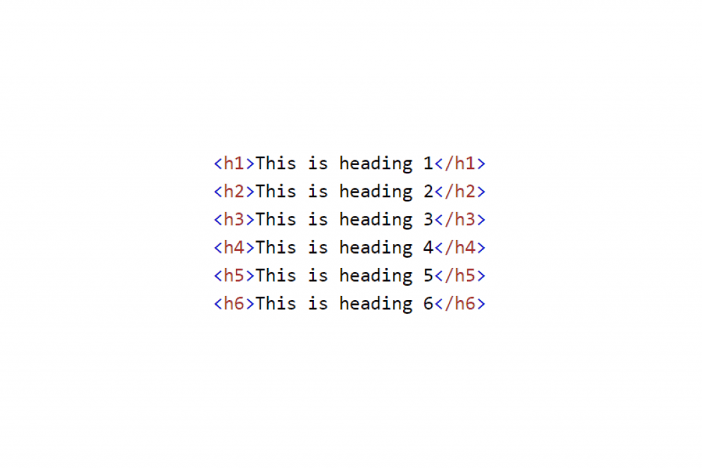
Most screen readers are designed to follow the structural hierarchy of a website so defining key headings on the page using the correct HTML tags will ensure the user will understand the site better. As simple as this may seem, many sites still do not obey this convention.
When creating headings, be sure to:
Use clearly defined headings to create hierarchy (This article is using a mixture of <h1>, <h2> and <h3> tags.)
Make the heading descriptive enough to give the reader enough information about what the section is about

2. Paragraphs
Paragraphs are another important structural element. Make sure your paragraphs are descriptive and address the topic the page focuses on. However, if the Heading tags are applied and correctly defined, this shouldn't be a massive issue.
3. Links
Links help us dash around the internet and are usually visually highlighted with a different colour and underlining. However, problems often arise with screen readers if links are not descriptive with poor anchor text.
Make sure all links within a web page should be properly labelled.
Ensure that they make sense to the user when read out of context.
4. Page Elements
Cycling through page elements like form fields and buttons can also cause issues due to a lack of proper labelling.
Pay attention to the names of each element within the page, keeping descriptive titles short and to the point to ensure the user can navigate with little resistance.
5. Hover States
Due to the way screen readers navigate a page, links and actions that are hidden behind hover states are invisible to the reader.
This means the user has no idea that the functionality exists as it won’t be read out to them. Because of this, all primary actions should be visible on the page and not hidden. This may be a compromise from a visual perspective, but it will ensure easy navigation for screen reader users.
6. Image Alt Text
Sometimes images within a web page provide important information or further context to the information around it, however, screen readers are currently unable to accurately describe images.
In the meantime, descriptive <alt> text should be added to all images to give the user an idea of the content within them. Try to describe what is happening in the image, rather than using a vague alt tag. Take a look at the example image below:
An example of good alt text for this image would be:

A person sat in an office at a Mac computer typing. The image on the computer screen reads “Designers should always keep their user in mind. Only then can you create truly innovative solutions.”
Bonus: Form Design
This is about how a screen reader understands the HTML and CSS of a page and conveys it to the user. For example, an icon can show up an error below the input box (see example below). This is not how the form should be ordered if you are designing with screen readers in mind.
The error should be positioned before the input box as this is a more natural reading order. The order of the content that’s read by a person’s screen reading software is determined by the order of the HTML elements.
Although the visual order can be changed through CSS, there shouldn’t be any need to compromise when one design can work for all without the need for extra changes.
Start Optimising for Screen Readers Now
Hopefully, these tips will give you all you need to begin improving your overall approach to accessibility. One thing to keep in mind is that there is a variety of screen reader software available across different platforms, the principal ones are:
Note: Be wary of this different software as they all have small differences in how they interpret and read the content.

Got an idea? Let us know.
Discover how Komodo Digital can turn your concept into reality. Contact us today to explore the possibilities and unleash the potential of your idea.

Sign up to our newsletter
Be the first to hear about our events, industry insights and what’s going on at Komodo. We promise we’ll respect your inbox and only send you stuff we’d actually read ourselves.


