Using Trust And Transparency To Build Fintech Apps That Succeed
UI/UX Design
For a digital business, building trust in a world of data breaches and privacy worries is tough. Fintech businesses have an added layer of responsibility to their customers. They need to be wary as they're dealing with sensitive personal information and finances within fintech apps. Trust isn't solely about security architecture and data privacy. If it were, there'd be no variance between the world's biggest banking apps - consumers would trust them all equally. So what is it that makes the difference? How does one Fintech app win trust and users over another, even when both have fantastic data privacy and security records? In this article, we are exploring how the concepts of transparency, open banking and UX design can influence Fintech customers. You'll learn about how UX design can build trust through macro and micro changes. And how that same trust can drive customer adoption and subsequently increase your design-driven ROI.
The Role of Open Banking in Fintech’s Future
Firstly, let’s talk about a UK ruling called Open Banking. This is the UK version of the PSD2 directive, designed to ensure open transparency in the banking industry. It has ‘cracked open' the UK’s banking industry to allow third parties to access key financial information with users' permission. For a user, Open Banking is a good move. It makes the banking industry more transparent and accountable to ensure market competition will push banks forward to offer better user experiences. Open Banking allows businesses to access customer information provided they have permission through a bank’s API. For consumers, this means easy access to apps that can help plan finances, track spending and other helpful information – but only if they grant permission. The benefits of Open Banking are clearly valuable to customers. Estimates predict that 60% of the UK population will be using it by 2023.

Open Banking has specific applications. A provider can only utilise it for accessing account information or payment initiation. Both require separate permissions from the user. To access Open Banking, you’ll need to be on the FCA register and Open Banking register. Open Banking is, of course, a powerful tool for increasing the utility of your product. Depending on the nature of your business, being able to access financial data or pre-approve payments can help smooth out a customer’s experience and make the conversion as simple as possible. Open Banking means Fintech businesses can offer:
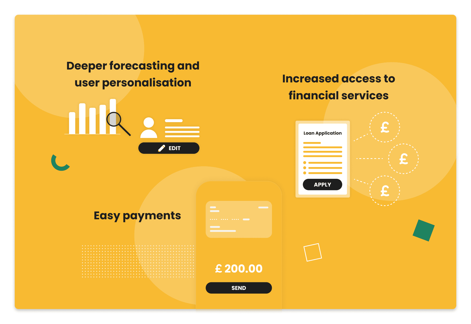
Deeper forecasting and user personalisation: not only will Open Banking facilitate a deeper level of personalisation for users, but it will also lead to more integrations with machine learning and big data to build predictive models that further benefit users' finance management and forecasting.
Increased access to financial services: the speed of authentication offered by Open Banking means more customers will have access to things like loan applications. Unlike traditional processes, these applications could even go to multiple lenders from one source. This would give the user the best possible result from one product.
Easy payments: the ability to initiate payments using a bank’s API means that users will benefit from instant payments, making sending a payment as simple as a message.
Like any new concept, open banking needs to build trust. That’s why it’s simply an introductory element in this article. The real challenge for Fintech businesses is still actually to build trust from the ground up. Open Banking is a great concept, but if nobody trusts your app or brand, they won’t willingly give their consent to grant the permissions Open Banking requires.
The Trust Pyramid and Fintech
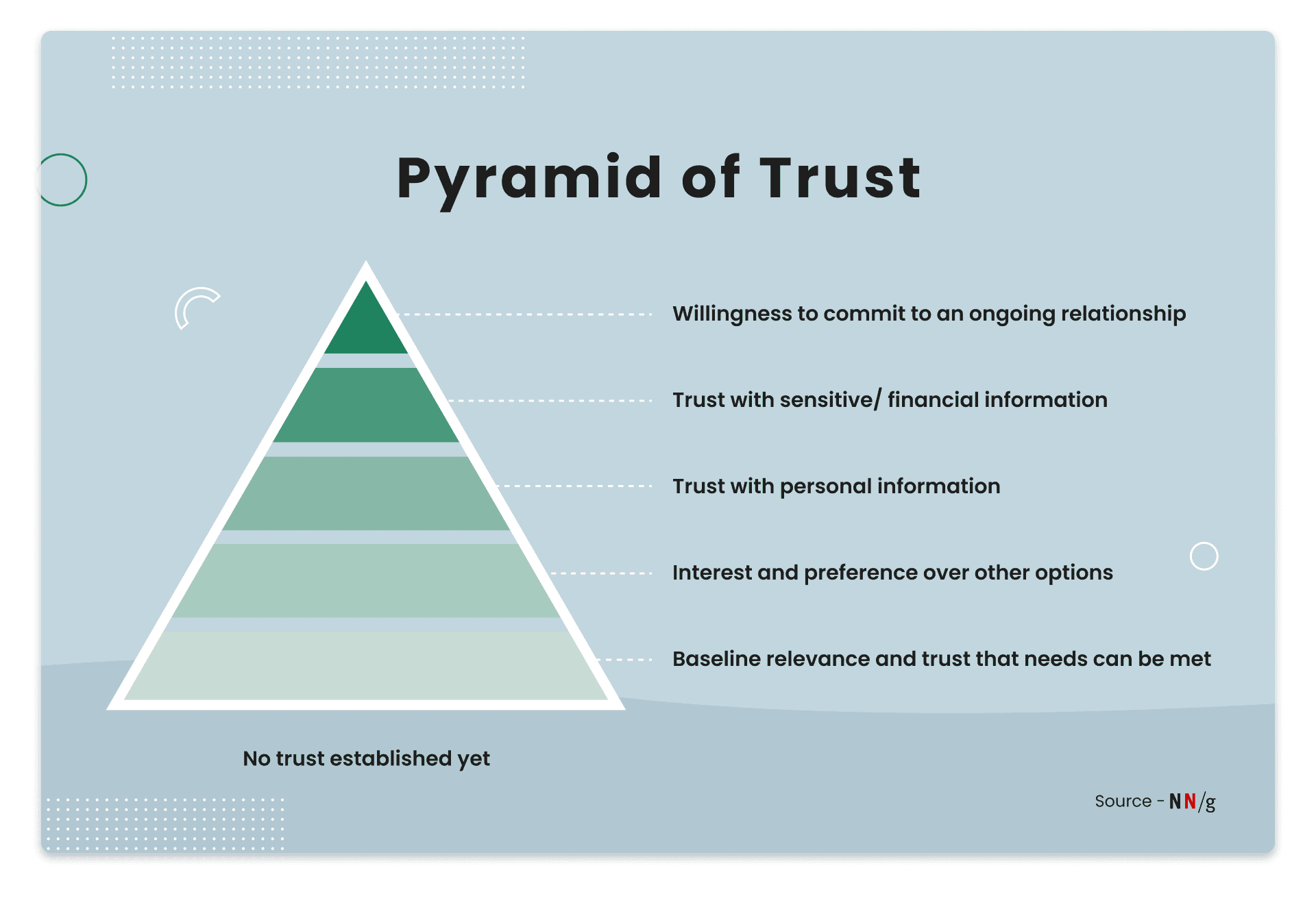
Trust is a vague idea that isn’t measurable by any defined metric. It is more of a concept than a science, something hard to pin down. Trust combines other judgements such as credibility, authority, reliability, helpfulness and friendliness. There is a Nielsen Norman Group concept that aims to define trust and user perception known as the Trust Pyramid, which has 5 levels. These levels can only be moved through when a user feels their needs are being met. But, those needs change as they begin to trust you more.

Level of Commitment User needs Baseline relevance and trust that needs can be met Does this site help me achieve my goal? Does it seem credible and does the information seem factual? Does it have my interests at heart? Interest and preference over other options Why should I choose this platform over any other option? What does it offer they don’t? Does it look or feel better than competitors? Trust with personal information Does the site offer enough value to justify the effort and time I need to input my information? Would I trust the brand behind the site/app with my information? Trust with sensitive/financial information Do I trust the site/app with my financial information? How risky is it? Willingness to commit to an ongoing relationship Should I allow a continuous connection with the app such as linking an account or authorising payments?
Fintech businesses don’t have the luxury of slowly working up this pyramid. They must IMMEDIATELY win enough trust from the first user interaction to reach the top layers and have users share financial information or even consent to ongoing payment relationships. To build that trust as quickly as possible, Fintech must turn to the field of UX design.
Building Trust Through UX Design
“UX/UI design plays an important role in establishing user trust. Research has shown that the usability and design of a digital product have a direct impact on a user’s trust in it. The UI should be clean, and intuitive and avoid looking dated. But there’s a delicate balance between making the app fun and engaging and making it overly informal so that it doesn’t seem legitimate. The app should provide clear instructions for tasks and double opt-ins to prevent user mistakes and allow them to feel more confident.” - Catrin Orr, UX/UI Designer at KOMODO
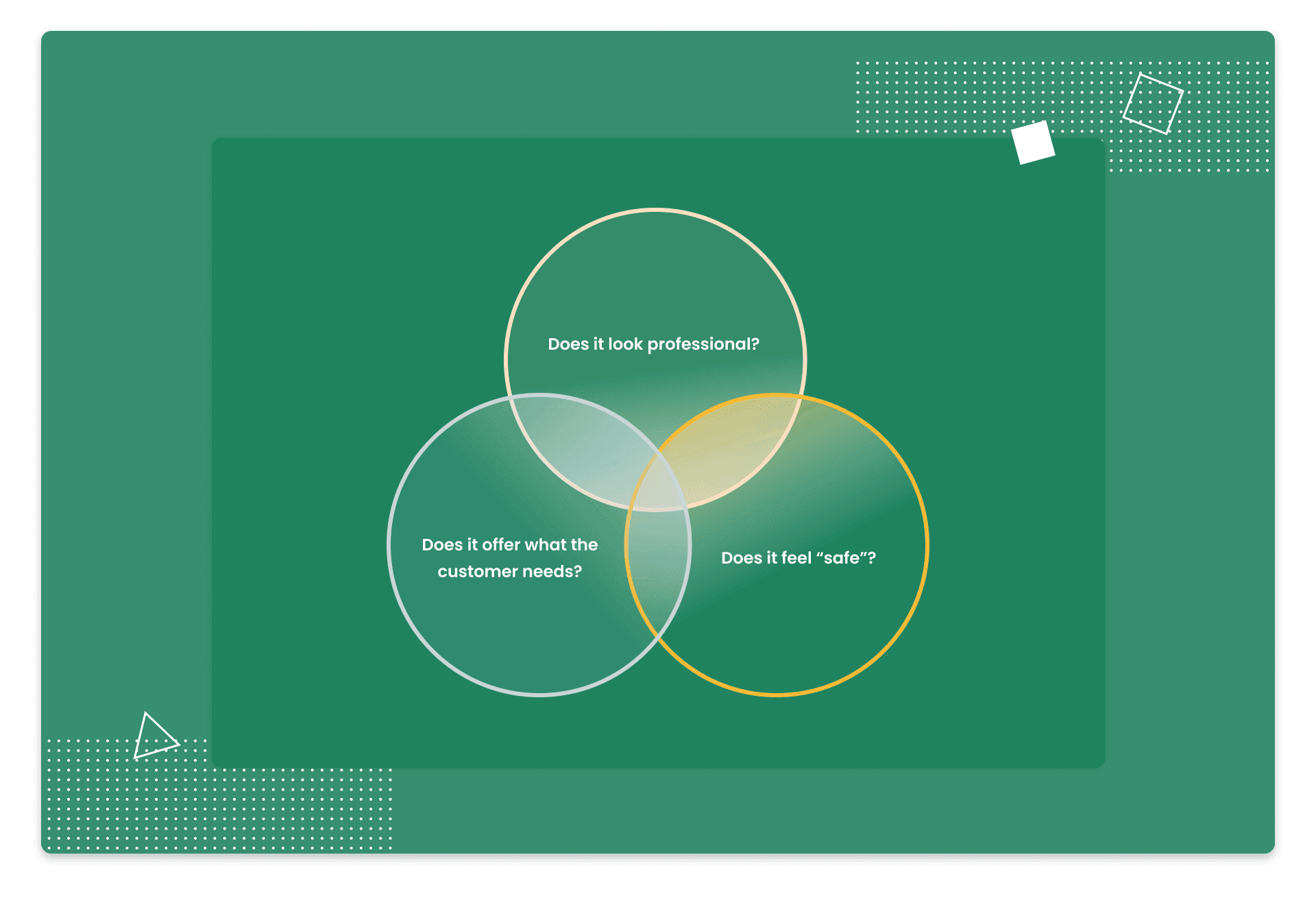
As Catrin suggests in the quote above, UX design has a fundamental role in building user trust. Trust is often based on a gut reaction to visual stimuli, made quicker than our conscious minds even realise. Google recently stated that users form opinions in as little as 17 milliseconds (0.017 seconds). Fintech apps must immediately jump up the trust pyramid by broadcasting trustworthiness instantly. Provided your security and privacy systems are watertight, it’s your UX and UI designers who are ultimately responsible for establishing trust. James Tabiner, Head of UX at KOMODO, refers to three fundamental ideas you should consider when designing an app. He encourages you to ask these questions about your product:
Does it look professional?
“In Fintech, you need a professional brand that comes across as competent. Eliminate typos, which are always a killer for trust. If spelling is incorrect anywhere in the app, trust goes out the window. So, invest in a good copywriter or editor. Consider adding trusted designs such as badges that show security over payments etc. They’re a dated concept, but still relevant and useful.”
Does it offer what the customer needs?
You need to conduct detailed user research before designing anything. User research helps you know who your users are, what they want and how your product will offer it. Further down the line, customising the platform around user behaviour and Open Banking information will help provide a tailored, competitive experience. All of these things rely on good onboarding processes. Read our onboarding guide here if you want a detailed look at this idea, or have the summarised version from James here: “Always try to guide the user through steps, really holding their hand to help build trust.”

Does it feel “safe”?
“Trust can be built through consistency. Build a consistent, human, brand experience across platforms to show users who you are, if they download your application they will most likely search for the company. If the experience is consistent and looks legit, the customer will trust the app more.” It’s vital to make it clear to users what you’re going to do with their data. Not only during onboarding but in all features of the app going forward. Tell them why you’re asking for certain permissions or information and show how giving said information might benefit them.
UX Design Tips for Fintech Apps To Build Trust
Once you’ve answered the questions above and have made sure you’re meeting compliance, regulatory and legal standards, the only differentiating factor between you and your competitors is the look and feel of your product. The design team are the people most responsible for establishing a sense of credibility and competency – both important ideas for building trust. The Interaction Design Foundation features a conceptual formula devised by Ken Thompson, head of Bioteams Design that aims to quantify trust. This formula is as follows:
Trustworthiness = Ability + Benevolence + Integrity
Ability is something demonstrated through your design. The product shows its ability, or competency, through well-planned UX design.
Benevolence is about assisting users with their goals in mind. Your product must be designed to actively assist with user needs.
Integrity is demonstrating ethical awareness, fairness and honesty in your design and wider brand. We’d argue that this also includes accessibility. Designers who make people with impairments or disabilities feel included will win more trust than those who don’t.
Of course, this isn’t an exact science – it’s one man’s theory. But, it’s a good demonstration of the fundamental concepts behind trust and how design is responsible for all three. With a desire to showcase ability, benevolence and integrity in mind, here are some of our top ideas for Fintech UX designers to incorporate into their product.
Make things efficient
COVID-19 brought a forced adoption to many digital banking services due to closures and lockdowns. For some users, this led to isolation and frustration. A Fintech app/product must always be designed to minimise frustration and make things intuitive for all levels of users. Note, however, that we didn’t say ‘make things simple’. In Fintech, making things overly simplistic can actually detract from trust.
Be wary of ultrafast processing times
Often, processes such as credit checks are perceived as untrustworthy if the app processes them too quickly. Companies like Credit Karma have actively designed a slower loading process to instil a sense of trust in customers when they’re performing tasks they feel should be given adequate attention.
Words matter, use them wisely
Clean, legible fonts are a must but the copy in your app should be faultless and designed to guide and assist your users. When asking for information or input, explain the value exchange a user can receive in return.
Be playful, but not too playful
Animations, gifs and emojis all have their place in a more personalised experience, but remember that users want to perceive a sense of professionalism from their Fintech apps. That doesn’t mean you can’t be playful. However, you have to balance that against quality and setting a certain level of adult expectation. Monzo has absolutely nailed the playful tone and the words matter points expertly. You can read their complete Tone of Voice Guide here.
Balance frustration against comfort
Most app designers are hesitant to include too many input requests that make a user’s life more difficult. The majority of UX design tips on the internet clearly state that the less a user has to input, the better for their experience. In Fintech, however, that balance is thrown out by a user’s need to perceive security and trust. Asking for additional information may reassure the user, whereas too little may create mistrust. Remember to explain why you need certain inputs to show value to the user.
Passive versus active signalling
Many of the biometric processes that Fintech apps use such as voice recognition can be considered either active or passive. Passive recognition is when a user doesn’t need to take any specific action, while active recognition will ask for a specified input. For example, many face recognition patterns are passive and don’t require input, whereas a fingerprint or signature would need a user to take action. In Fintech apps, use passive biometrics early to make things simple for users – but place active recognition in front of the most critical parts of your app such as submitting a loan request or initiating a large transaction. This will help instil a sense of security and trust, whilst also reducing any user hesitation because they’ll feel the active measures are justified by the higher importance of the most critical app features.
Automate security measures
UX design is all about making a user’s life easier and their interaction with an app more intuitive. But sometimes, you must design for when a user is NOT using the product. In Fintech, where delicate financial information is often displayed in the UI, designers should create automatic sign-out functions or ways to quickly hide/obscure information if a user is not actively engaged.
Personalise where possible
In our Fintech onboarding article, we talked about the power of personalisation. In general, personalising an app experience around a user helps make them feel more catered for – which in turn increases their trust. However, like many things in Fintech, this is a balance. You don’t want to ask for too much personal information if you don’t absolutely need to. Consider implementing a customised personalisation experience where the user can choose certain goals or features based on their needs, giving them a feeling of control over the product. For example, a budgeting app may ask users what their monthly saving goals are and what purchases they want to log or hide.
Be consistent and accessible
“Create a consistent approach: Consistency across the user interface design in regards to componentry, branding, content and marketing can help to build a more intuitive flow and meet the user's needs — helping to build familiarity and trust.” “Accessibility across the board can also help build a lot of trust. Allowing a user to understand they are being catered for, whether that’s through tweaks to colour accessibility, legible text, alt tagging etc or even delving into the development side of things where necessary.” - Thomas Wood, Head of Product Design at KOMODO
Avoid ‘Dark’ UX
“Avoid dark UX patterns - such as Amazon’s 30-day prime trial, which essentially guides a user to sign up through a clandestine approach such as highlighting a call to action and switching main states so the user will go down the path of signing up even though they may not want to.” - Thomas Wood, Head of Product Design at KOMODO
Design around open banking
Open Banking is something to be embraced by UX designers. The API technology behind it means that you may not require as much user input as you would have otherwise. However, you still need users to trust you enough to grant Open Banking permissions, so the measures above are just as relevant.
Overview
Trust is not a defined or measurable metric. Despite this, Open Banking and overall industry transparency show a clear desire for change. A more user-focused financial sector will make experiences as easy as possible for end-users. Fintech businesses have an excellent opportunity to launch user-focused products that can access incredible data. The real test is whether they can build the trust needed to get a user on board. If you’d like to work with a team that excels in building trust through UX design, contact KOMODO today. We work with Fintech businesses to help refine existing apps, reboot failing ones or revolutionise the sector with something new.

Got an idea? Let us know.
Discover how Komodo Digital can turn your concept into reality. Contact us today to explore the possibilities and unleash the potential of your idea.

Sign up to our newsletter
Be the first to hear about our events, industry insights and what’s going on at Komodo. We promise we’ll respect your inbox and only send you stuff we’d actually read ourselves.


